
The Challenge
Gender-based violence is not only a problem of recognising violence once it happens. Prevention starts much earlier — with how young people understand relationships, affection, jealousy, control and gender roles.
1 in 3
women aged 16 – 24 reported experiencing controlling behavior from a partner
4 in 5
teenagers or young adults know a woman or a girl that has suffered gender-based violence
20%
of young adults and teens reject the concept of “gender-based violence”
For this project, I wanted to explore how digital product design could contribute to prevention and awareness among teenagers and young adults.
The initial challenge was broad:
How might we help young people understand gender-based violence without making them feel lectured, judged or overwhelmed?
Research showed that young people were already exposed to conversations about relationships and gender through social media, entertainment and peers, but lacked tools to recognise subtle forms of violence and guidance on how to respond.
The opportunity was to create an experience where users could see themselves in a situation, make decisions, experience consequences and then connect those experiences with reliable information.
That became the foundation for Cuentacari.
The Process
During my internship at a Venture builder, I learned about the Double Diamond framework and how – despite similarities – it slightly differs from the Design Thinking framework in that it typically is used in a more linear way.
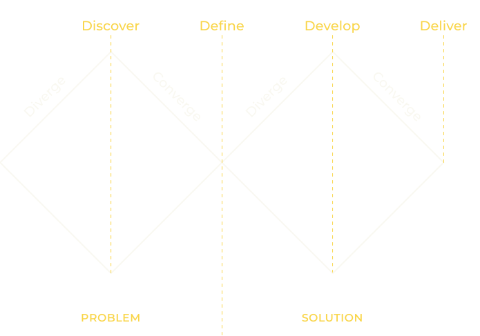

Discovery
Conducting user research to understand users, their needs and their problems.

Definition
Using the research insights in order to define and prioritise the problems that can be solved.

Development = Design
Designing wireframes and prototypes to solve the user’s problems.

Delivery = Testing
Testing the solutions with users.
Discovery
During the discovery phase, I thoroughly investigated gender-based violence and its perception among teens and young adults.
To investigate such a complex topic, a combination of various research sources and methods was necessary.
This comprehensive approach provided insights into the specific challenges faced by the target users and informed the subsequent design decisions.

Secondary & bibliographic research
Spain is a pioneer country in tackling gender based violence. In this context, there is already extensive quantitative and cualitative content available to research it’s causes, it’s types and general trends across specific age groups. This material was the base for further research.

In-depth interviews with experts
I got in contact with psychologist + equality & Gender politics expert Dolores Martínez; and author + workshop facilitator Melissa Lopez, who collaborate together on imparting educational workshops in schools about the topic. The goal was to gather qualitative information about their hands-on experience with teens in the therapeutical and school context.

User surveys
In search of deepening my understanding of the problem from the 1st person perspective of the target user group, I conducted user polls with Google Forms. There I targeted the main challenges extracted from the previous research. Of course, due to time and resources constraints, this source was taken into account as qualitative.

Competitor & Benchmark analysis
Comparing the existing similar digital products and initiatives in Spain, analysing their success and failure points.
Definition
During the definition phase of the project, my goal was to sinthesise the problem space and target user group, and to set the core goals, boundaries, and clear requirements.
To summarise the high volume of information gathered by research, a few visualisation frameworks had to be combined.
This synthesis of the information helped create an insights map, a value proposition canvas and a counterbriefing for the product proposal.
Defining the users
Research identified two primary user groups:

Young people · 12–26
ooking for accessible, engaging and trustworthy information.

Educators & youth workers
Needing tools to facilitate conversations, identify indicators and understand their groups.
Rather than creating one generic experience, I designed different journeys for each audience.
Young people could play the first story before registering, allowing them to experience the product’s value first.
Educators were introduced directly to their dedicated tools, including group management and a sociogram.
The core of Cuentacari
Expert interviews highlighted the importance of addressing not only indicators of violence, but also healthy relationship models and how to support someone experiencing violence. They also suggested combining storytelling with quizzes and reliable information.
This led to a core product principle:
Experience → Reflect → Learn
Instead of telling users what to think, Cuentacari lets them encounter situations, make decisions and explore their consequences.
The core experience is an interactive narrative where users make decisions that influence the story.
In Cuentacari, users follow the story of Paula and Adrián, through the lenses of different characters.
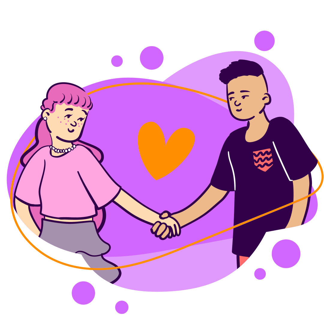
The stories explore not only explicit violence, but also more subtle behaviours such as control, isolation, jealousy and unhealthy relationship dynamics.
The interaction model became:
Encounter → Decide → Experience → Reflect → Learn
Storytelling and quizzes work together to connect emotional experience with evidence-based learning.
Design & Testing
Prototyping & Testing are crucial steps in the design process that help refine the product and ensure a user-centric experience. Each refinement stage is adapted to the testing results. Here’s the overview of my approach to the overall Product design and its Design system.

Step One: Information Architecture
To keep things lean, I decided to first get the information architecture right. For this I used the cardsorting method with a focus group of users. In this case, to save time I chose a hybrid card sorting session.
Based on this card sorting, I established the app’s Sitemap.

Step Two: Userflows and Low-Fidelity Prototypes
Alongside with the cardsorting, I generated a few user flows and picked the key ones for further refinement.
Then I created a low-fidelity prototype creating wareframes in real life scala using paper cutouts in the size of a mobile phone. These flows were then guerrilla tested –in order to save time and effort –with a reduced group of classmates and my thesis tuthor.
Then, with information gathered with this minimal protoype I created a mid-fidelity one using Figma. This mid-fidelity prototype was tested with a target user group to make sure that the flows were understandable and the didactic goals were achieved. The moderated testing session was done live using the Figma prototyping functions in it’s mobile app.

Step Two: Design System & High-Fidelity prototype
Alongside the previoius user experience centered stages, I was craftting its Design System. In this case, to showcase my graphic design skills, the Design System was all encompassing –Branding, Storytelling, Illustrations, Game mechanics and UI elements were all considered. First I created the Cuentacari Brand, establishing it’s values, Design Principles and basis graphic elements: logo, color scheme, and fonts.





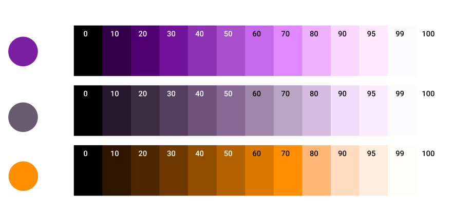
For the UI specifically –following the process of Atomic Design–, I created the token styles, then built the atomic components, the molecule components and finally the patterns and screens required to complete the selected user flows.
The Design System, Diseñacari, was documented in zeroheight in combination with Figma. This was the workflow used at the time at the Venture Builder I was working at.
To conclude, I created as high-fidelity prototypes in fgma as possible. These were tested rather to gather the qualitative perception of the users regarding the look & feel to see if matched the Branding. This moderated testing session was done remotely via Figma Prototyping + Google Meet.
Outcome
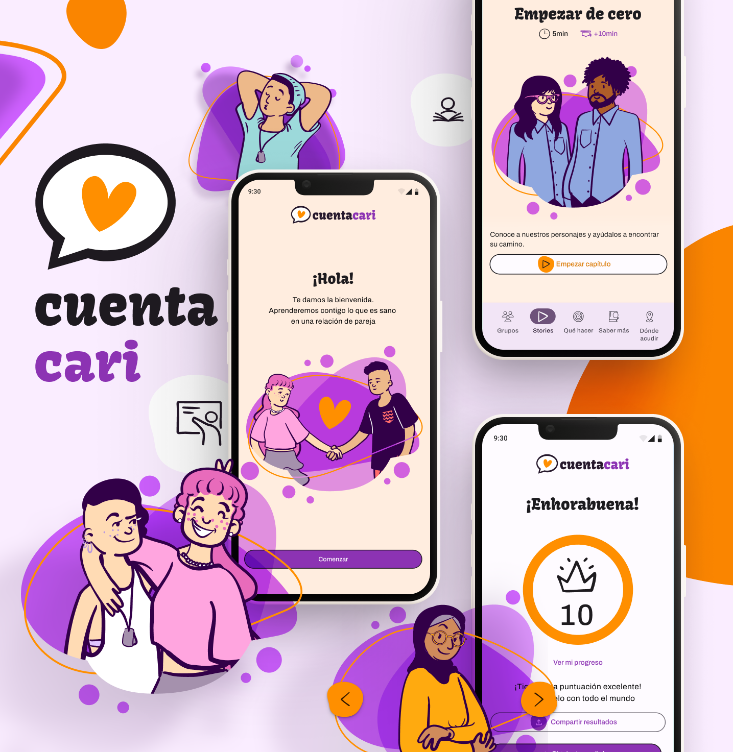
Cuentacari, the mobile storytelling game that teaches teens and young adults about healthy relationships.